Bayesian Methods for Ecological and Environmental Modelling
Author
Peter Levy
Published
March 22, 2024
library(ggplot2)library(rworldmap)
Loading required package: sp
### Welcome to rworldmap ###
For a short introduction type : vignette('rworldmap')
library(raster)library(geoR)
--------------------------------------------------------------
 Analysis of Geostatistical Data
 For an Introduction to geoR go to http://www.leg.ufpr.br/geoR
 geoR version 1.9-2 (built on 2022-08-09) is now loaded
--------------------------------------------------------------
set.seed(448)#Define geographic projections to be used# lat / lon projlonlat <-CRS("+proj=longlat +datum=WGS84")
Introduction
In this practical session, we will look at real examples of applying the Bayesian approach to statistical spatial modelling. The field of spatial modelling has developed its own terminology which can be confusing, but the gist is simple. We have observations of a variable \(z\) at a number of locations. To estimate or predict \(z\) at a new location, we could use the mean of the observations weighted by their proximity (i.e.by the inverse of distance from the new location). Nearby points have a strong influence, far-away points less so.
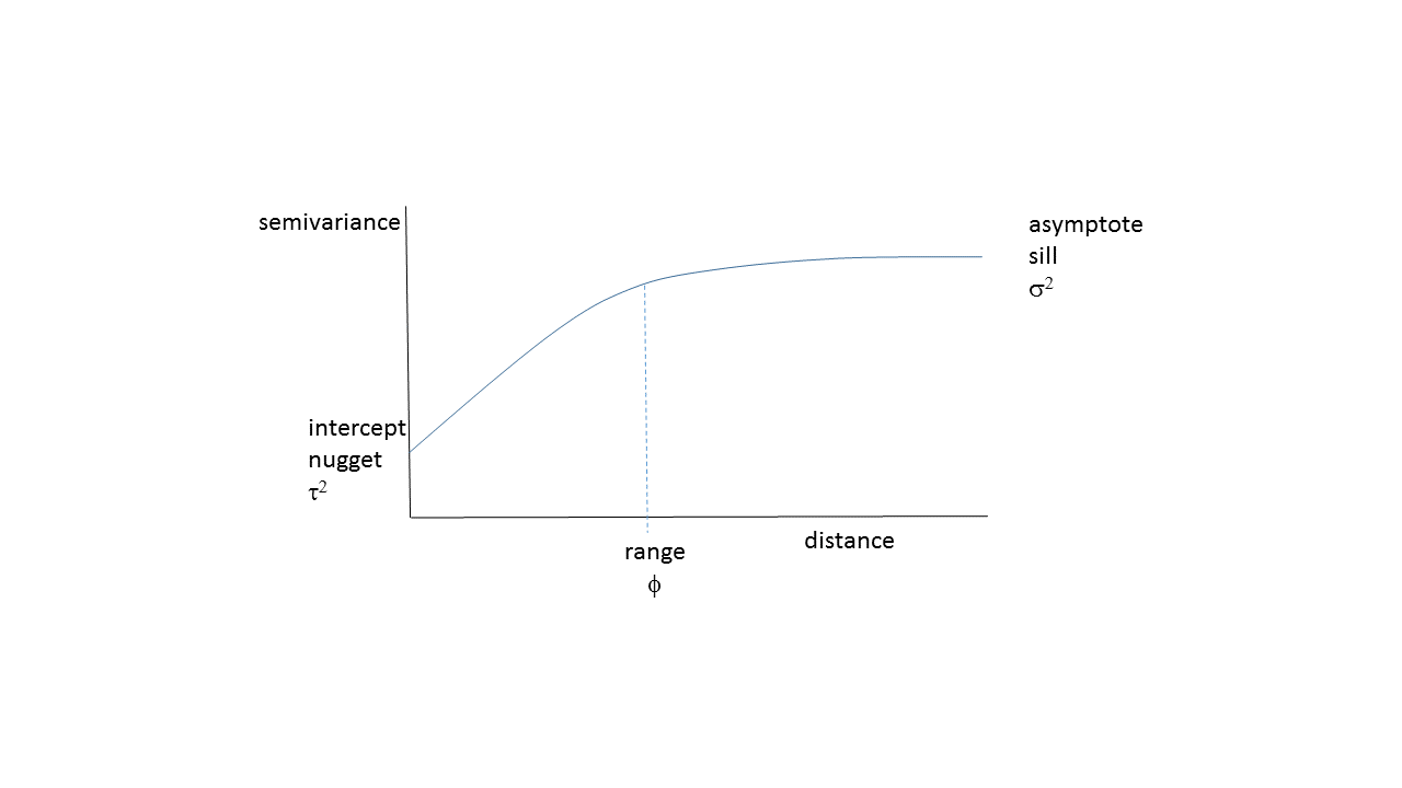
A more sophisticated approach is to model how proximity actually influences the weights, based on the observed data. This model is known as a (semi)variogram - for every pair of points, we calculate the distance separating them and the difference in \(z\) (expressed as half of the squared difference). Often, nearby points tend to be similar; as distance between points increases, they are generally less similar, so the semivariance increases to an asymptote, which is the overall variance in \(z\).
Variogram model showing the typical increase in dissimilarity as distance between points increases. The commonly used terms for the parameters of such a model are shown.
Using the weights calculated from a fitted variogram model to predict values on a grid around the observations is known as “kriging”, and is a standard way of interpolating spatial data. Conventional kriging fits the variogram model by least-squares, and then treats this as a fixed, known quantity. The Bayesian approach recognises that we do not know the true variogram model parameters, but estimates their posterior probability distribution, given the data. We can then sample many possible realisations of the variogram parameters, and thereby produce many possible realisations of the predictions (the interpolated values on a grid). Considering the variance among these realisations gives us a good estimate of uncertainty in the predicted values of \(z\), and potentially better estimate of the mean.
We now consider two examples of of applying Bayesian kriging to real spatial estimation problems. We use the the geoR package in R to do this. This allows us to use (hopefully) familar R function syntax, and saves us having to write out the whole geostatistical model in JAGS.
Case study 1: Spread of Agriculture in the Neolithic Period
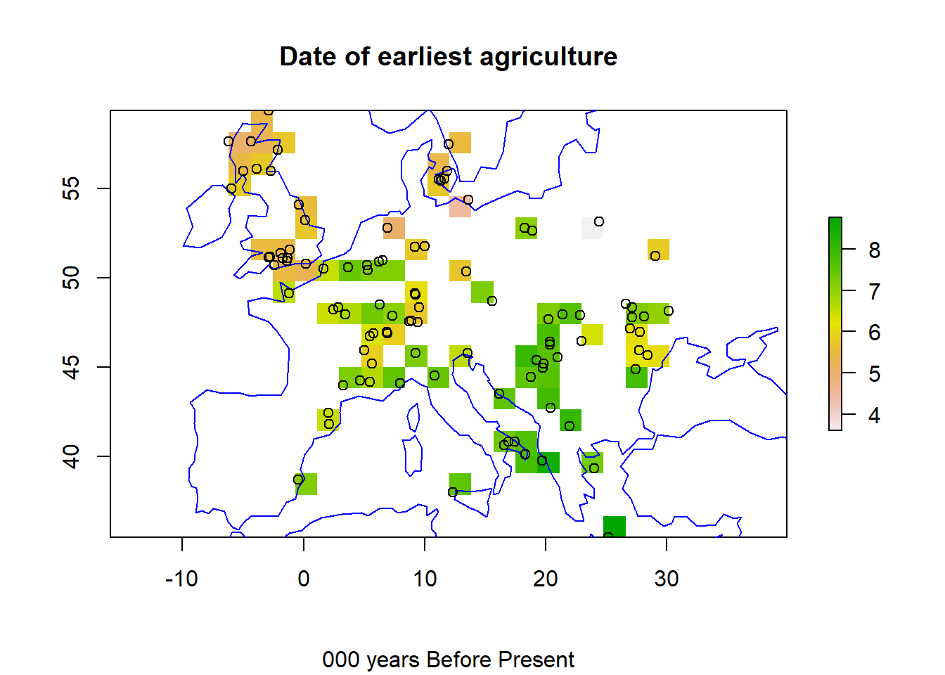
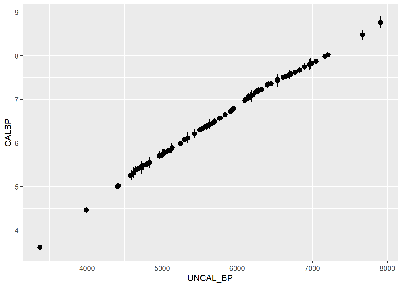
Around 8000 years ago, human society made the transition from hunter-gathering to growing domesticated crops - the start of agriculture. Radiocarbon data from agricultural artefacts can give an estimate of the earliest date for agriculture at archaeological sites. Isern et al. [-@Isern2012] collate such a data set, and infer the pattern in the spread of agriculture in Neolithic times. Here, we reanalyse this data, using Bayesian kriging to provide estimates of uncertainty.
# First, we load the data, put it in an empty raster and plot it.load(url("https://raw.githubusercontent.com/NERC-CEH/beem_data/main/neolithic.RData"), verbose =TRUE)
Loading objects:
  df
data(coastsCoarse)r <-raster(ext =extent(df), nrows =20, ncols =20)r <-rasterize(df, r, field ="CALBP")plot(r)plot(coastsCoarse, add=TRUE, col='blue')points(df)title(main ="Date of earliest agriculture", sub ="000 years Before Present")
grid_coords <-coordinates(r) # save the xy locations for geoRedinburgh <-c(-3, 56) # a location for prediction in lon, latminsk <-c(29, 56) # a location for prediction in lon, latgrid_coords_2testSites <-rbind(edinburgh, minsk)
The \(z\) values show the earliest date of agriculture at 100 sites, in 000s of years before present (8 ka BP = 8000 years ago).
Is there a spatial pattern in these data? How would you interpret it?
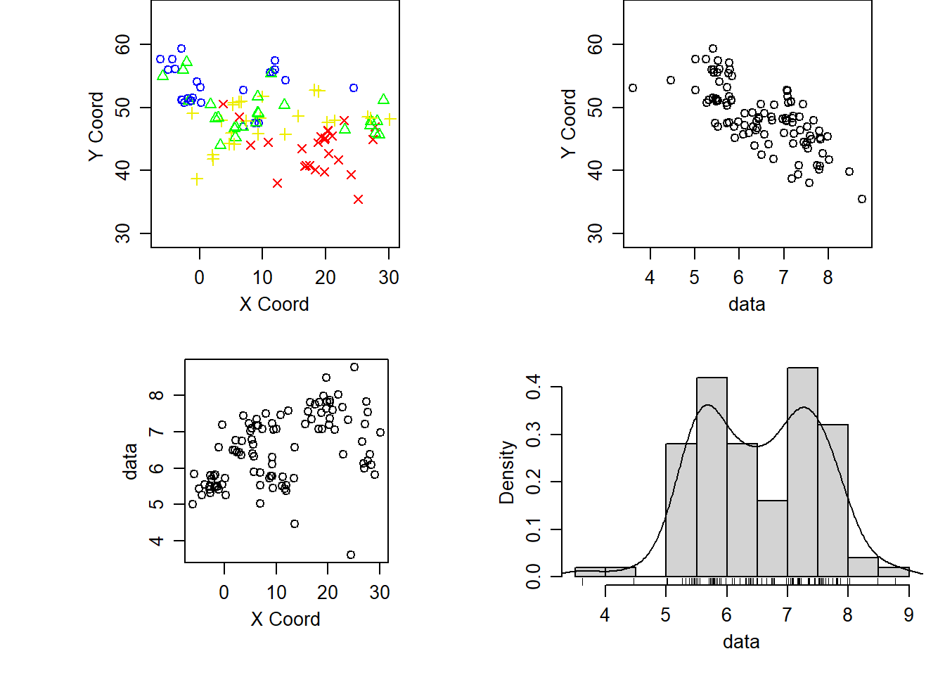
We convert the data to a “geodata” object used by the geoR package, and use its built-in summary and plot routines.
# df is the common generic data frame name# dg is my analagous generic geodata object namedg <-as.geodata(df, data.col =4) # date "CALBP" is in the fourth columnsummary(dg)
Number of data points: 100

Coordinates summary
    LONGITUDE LATITUDE
min     -6.21    35.51
max     30.18    59.35

Distance summary
        min         max
 0.09219544 38.38451901

Data summary
   Min. 1st Qu.  Median    Mean 3rd Qu.    Max.
3.61100 5.73025 6.49450 6.52259 7.25125 8.76900
plot(dg)
What features do you notice in the data?\(~\)
\(~\)
Construct a variogram
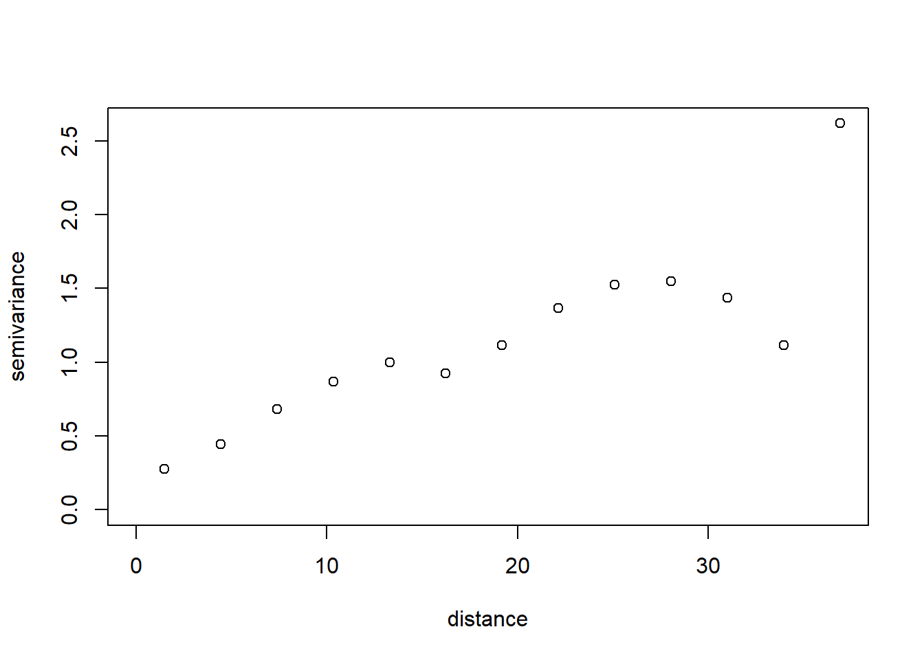
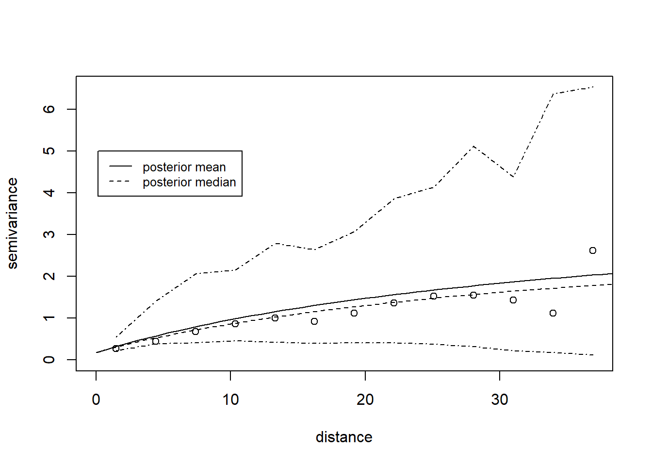
We construct a variogram using the geoRvariog() function. This creates bins for separation distance and calculates the semivariance in each.
vgm <-variog(dg)
variog: computing omnidirectional variogram
plot(vgm)
Does the variogram look reasonable?\(~\)
\(~\)
Examine the vgm object. vgm$n gives the number of points in each distance bin. The greatest separation distances have fewest points, so carry less weight. We will use the krige.bayes function to estimate the parameters of a vargiogram model, and to predict values on the regular grid shown in the first figure.
Specifying priors
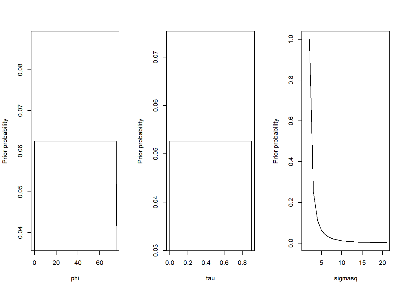
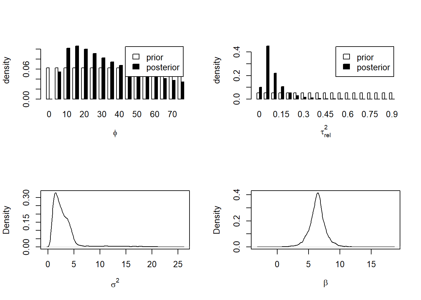
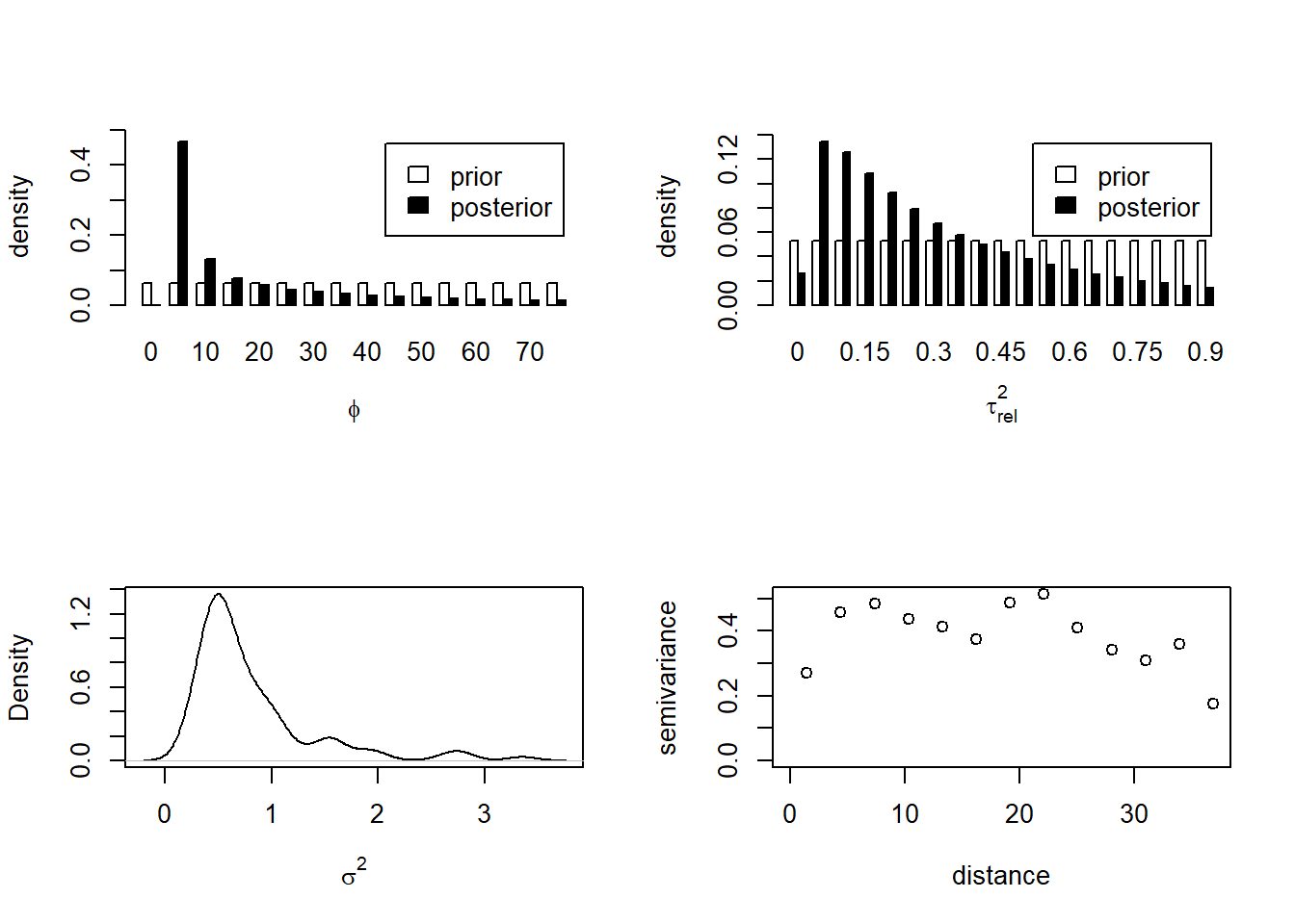
First, we need to specify the prior distributions for the \(\phi\), \(\tau^2\) and \(\sigma^2\) parameters (and also for \(\beta\), the mean of \(z\), although this is not a spatial parameter - yet).
geoR does not use MCMC to estimate parameters, but an approximation. One of the numerical tricks it uses is to discretise some of the prior distributions to make computation easier. We do this here for \(\phi\) and \(\tau^2\):
range \(\phi\) - we assume a uniform distribution between 0 and twice the maximum in the data
intercept \(\tau^2\) - this is specified as a fraction of the asymptote \(\sigma^2\), “tausq.rel”. We assume a uniform distribution between 0 and 0.9.
asymtote \(\sigma^2\) - we assume a “reciprocal” prior, where larger values become diminishingly probable, in inverse proportion to \(\sigma^2\)
mean \(\beta\) - we assume a uniform distribution between 0 and infinity i.e. completely uninformative; “flat” in the geoR syntax.
The lines below specify these distributions, which are plotted below.
maxdist <- vgm$max.distseqphi_sparse <-seq(0, 2*maxdist, by =5)seqtau_sparse <-seq(0, 0.9, by=0.05)
Estimate the vargiogram model parameters
Now we use the krige.bayes function to estimate the variogram parameters. We do not make predictions over the grid yet, to make the computation quick.
variog.env: generating 99 simulations (with  100 points each) using the function grf
variog.env: adding the mean or trend
variog.env: computing the empirical variogram for the 99 simulations
variog.env: computing the envelops
Can you relate these values back to the variogram?Are we reasonably confident in the estimated variogram?\(~\)
\(~\)
Make predictions
Next we make our posterior predictions over the grid covering the whole of Europe. This is more time-consuming, so we produce only 100 samples from the posterior, instead of 10000 as above.
Do the predictions from Bayesian kriging interpolate in a reasonable way?\(~\)
\(~\)
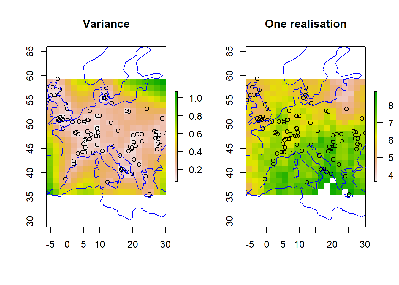
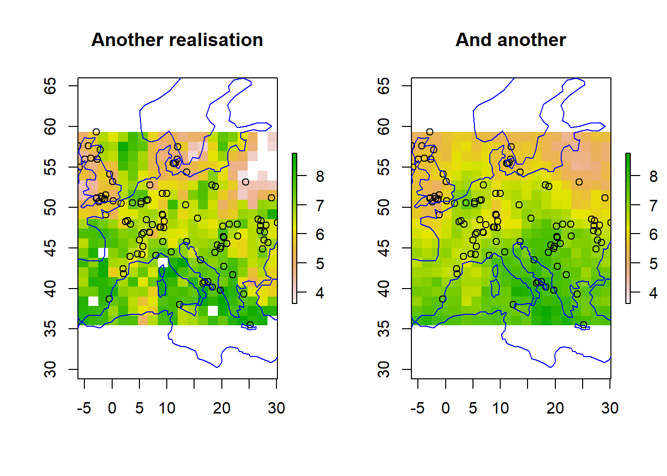
Critically, Bayesian kriging gives us estimates of uncertainty in the interpolation. The variance plot below shows where we are confident of predictions and where we are not. This comes from looking across the possible realistions of mapped predictions in our posterior distribution. Three samples (realistions) are shown below.
par(mfrow=c(1,2))plot(r_var, main ="Variance")points(df)plot(coastsCoarse, add=TRUE, col='blue')plot(r_s1, main ="One realisation", zlim = zrange)points(df)plot(coastsCoarse, add=TRUE, col='blue')
plot(r_s2, main ="Another realisation", zlim = zrange)points(df)plot(coastsCoarse, add=TRUE, col='blue')plot(r_s3, main ="And another", zlim = zrange)points(df)plot(coastsCoarse, add=TRUE, col='blue')
How does the distribution of observations match the uncertainty?\(~\)
\(~\)
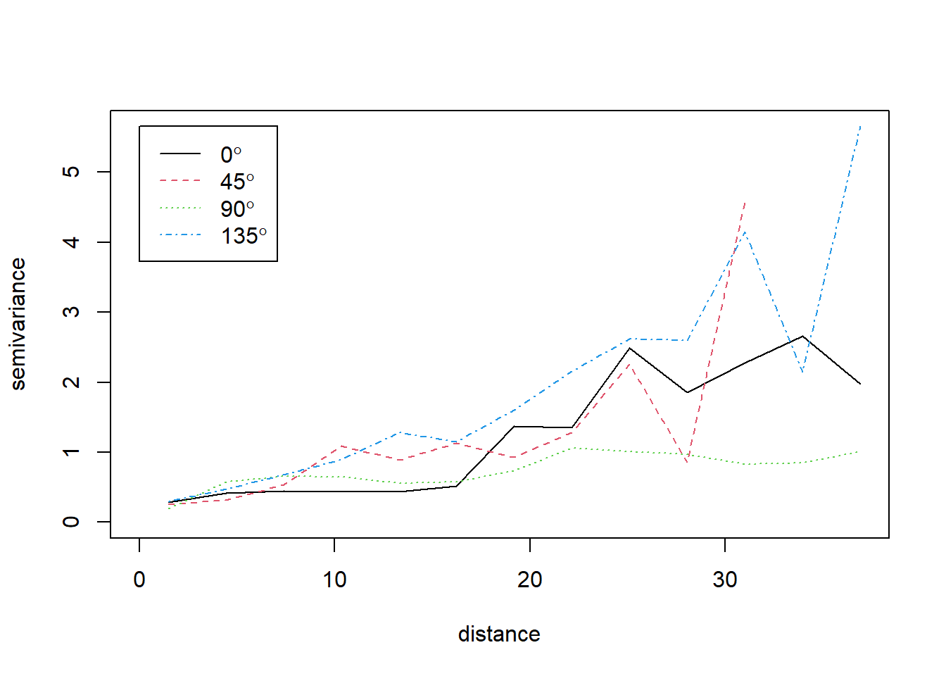
Including spatial trends
We can also look at “anisotropy” in the variogram - are things the same in all directions? We use the variog4 function to do this automatically, looking in four directions (0 = N-S; 45 = NE-SW; 90 = E-W; 135 = SE-NW).
par(mfrow =c(1, 1))vgmDir <-variog4(dg)
variog: computing variogram for direction = 0 degrees (0 radians)
        tolerance angle = 22.5 degrees (0.393 radians)
variog: computing variogram for direction = 45 degrees (0.785 radians)
        tolerance angle = 22.5 degrees (0.393 radians)
variog: computing variogram for direction = 90 degrees (1.571 radians)
        tolerance angle = 22.5 degrees (0.393 radians)
variog: computing variogram for direction = 135 degrees (2.356 radians)
        tolerance angle = 22.5 degrees (0.393 radians)
variog: computing omnidirectional variogram
plot(vgmDir)
What do you conclude from this? \(~\)
\(~\)
The observations have clear spatial trends, the largest running SE to NW. It may help to remove the large-scale spatial trend, and krige the residuals. We can do this by adding trend terms in the model.control section of krige.bayes, for both the observations (trend.d for “data”) and prediction (trend.l for “locations”).
   user  system elapsed
  25.72    0.14   25.89
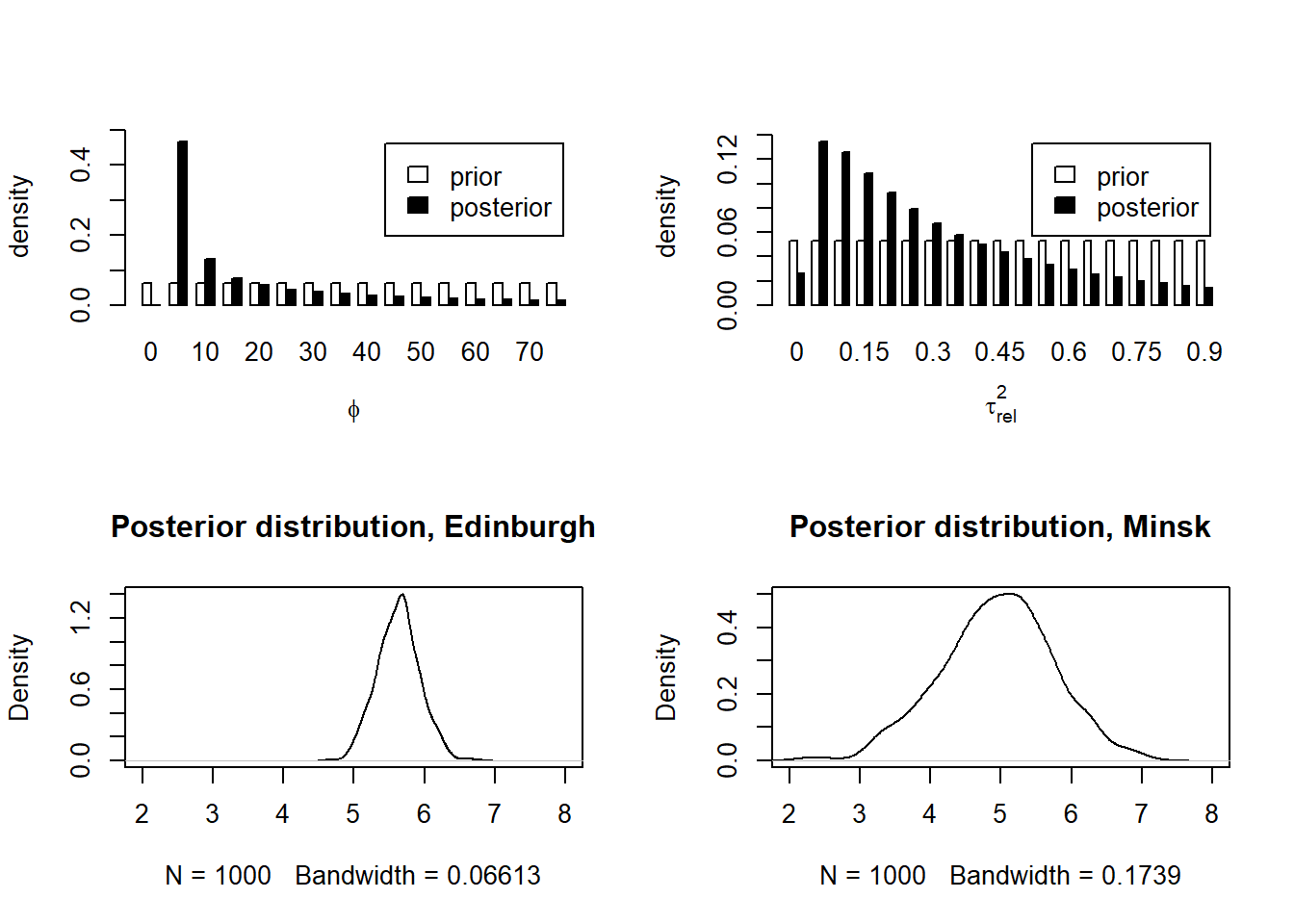
Again, we can plot the posterior distribution of the three variogram parameters
# Now we do the analysis with east*north trends:par(mfrow =c(2, 2))plot(bsp)plot(density(bsp$posterior$sample$sigmasq), main ="", xlab =expression(sigma^2))vgm <-variog(dg, trend ="1st")
variog: computing omnidirectional variogram
plot(vgm)
and extract the parameter posterior means and standard deviations. \(\beta\) is no longer the mean, but the regression coefficients for \(x\), \(y\) and \(xy\).
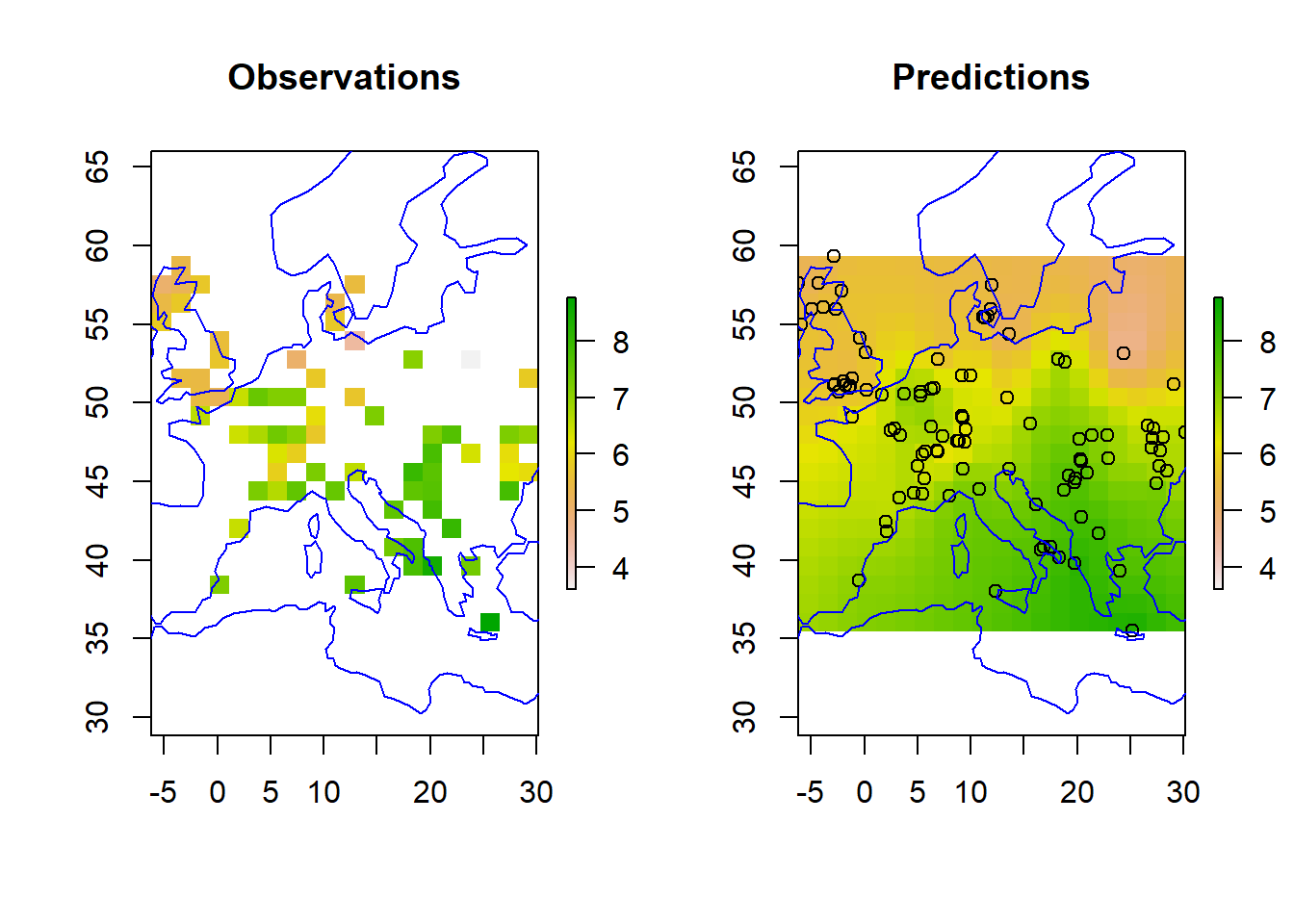
Plotting the new predictions, we can see they have not changed dramatically.
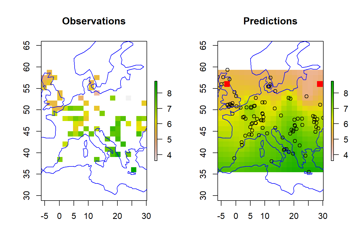
r_mean <-setValues(r, bsp$predictive$mean)r_var <-setValues(r, bsp$predictive$variance)r_s1 <-setValues(r, bsp$predictive$simulations[,2])r_s2 <-setValues(r, bsp$predictive$simulations[,3])zrange <-c(min(df$z), max(df$z))par(mfrow=c(1,2))plot(r, main ="Observations", zlim = zrange)plot(coastsCoarse, add=TRUE, col='blue')plot(r_mean, main ="Predictions", zlim = zrange)points(df)plot(coastsCoarse, add=TRUE, col='blue')# add in two test sites toospdf_2testSites <-as.data.frame(grid_coords_2testSites)coordinates(spdf_2testSites) <-~V1 + V2projection(spdf_2testSites) <- projlonlatpoints(spdf_2testSites, col='red', pch =15, cex =1.5)
Lastly, we can look at two contrasting sites, Edinburgh and Minsk, the red squares in the map above. Minsk (in Belarus) is outwith the area covered by observations.
   user  system elapsed
   1.59    0.16    1.75
[1] 5.625038 4.971365
[1] 0.3071959 0.7859604
\(~\)
\(~\)Is it clear why the uncertainties are different?
Things to explore:
Can you find a way to decrease the uncertainties?
Try different:
variogram models
prior distributions
spatial trends
How would you estimate the uncertainties in a non-Bayesian way?
How would you incorporate the uncertainty in the radiocarbon dates themselves?