Bayesian Methods for Ecological and Environmental Modelling
Author
Peter Levy
Published
June 19, 2025
Introduction
In this practical session, we will look at an example of applying the Bayesian approach to propagating uncertainty in observations. Measurements often involve one or more calibration steps because we do not directly measure the quantity of interest, but something closely related to it. Environmental sensors (thermometers, anemometers, pH probes etc.) are designed to give an output signal which closely matches the input (temperature, wind, pH etc). The “measurement” or “observation” thereby has an implicit modelling step (such as a calibration curve), and the uncertainty in this is usually ignored, assuming it is negligible. However, sometimes the calibration curve contains substantial uncertainty, and this should be propagated into any analysis which uses the data.
The Bayesian approach recognises that we do not know the true calibration parameters, but estimates their posterior probability distribution, given the data. We can then sample many possible realisations of the calibration parameters, and thereby produce many possible realisations of the predictions (the values that we indirectly measure). Considering the variance among these realisations gives us a good estimate of uncertainty in the calibrated values.
Here, we consider an example of applying the Bayesian approach to a real calibration problem - estimating flow in a stream. We use the rstanarm package in R to do this (rstanarm stands for “Applied Regression Modelling with Stan in R”). This allows us to use the same syntax as for standard linear modelling in R, and saves us having to write out the model in full in another language. Like JAGS, Stan is both a language for specifying probabilistic models, and a computer program to solve them, written in C++. (Stan is named after Stanislaw Ulam, inventor of the Monte Carlo method). For our purposes, rstanarm provides an easy way to specify a model and estimate the parameters by MCMC very efficiently.
Case study: Measurement of stream flow
Measuring and understanding flow in rivers and streams is a fundamental part of hydrology. The response of stream flow to rainfall in the catchment determines the likelihood of flooding, and tells us about evapo-transpiration in the catchment. To estimate the annual loss of nitrogen, carbon or pollutants from a catchment, we need to know the annual stream flow.
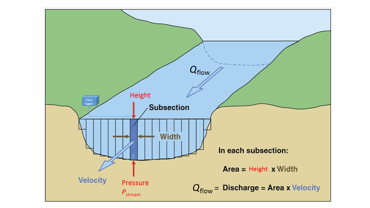
The quantity we actually measure continuously is the water pressure, \(P_{\mathrm{stream}}\) in milli bars (mbar), with a pressure transducer located in the stream. The measured pressure is directly related to the volume of water in the column above the sensor, and thus the height of the stream. The height of the stream is related to the stream flow rate or discharge \(Q_{\mathrm{flow}}\) in l s\(^{-1}\), from the geometry shown above. We thus have a linear model:
which we need to calibrate. This is done with manual monthly measurements of stream height, width and velocity. In this practical, we look at how the uncertainty in this calibration propagates, with an example from a local field site - the Black Burn at Auchencorth Moss south of Edinburgh, which feeds into the North Esk river.
Data set: Black Burn at Auchencorth Moss
First, we load the data set and examine it.
library(ggplot2)
Warning: package 'ggplot2' was built under R version 4.4.3
library(openair)
Warning: package 'openair' was built under R version 4.4.3
library(rstanarm)
Warning: package 'rstanarm' was built under R version 4.4.3
Loading required package: Rcpp
Warning: package 'Rcpp' was built under R version 4.4.3
This is rstanarm version 2.32.1
- See https://mc-stan.org/rstanarm/articles/priors for changes to default priors!
- Default priors may change, so it's safest to specify priors, even if equivalent to the defaults.
- For execution on a local, multicore CPU with excess RAM we recommend calling
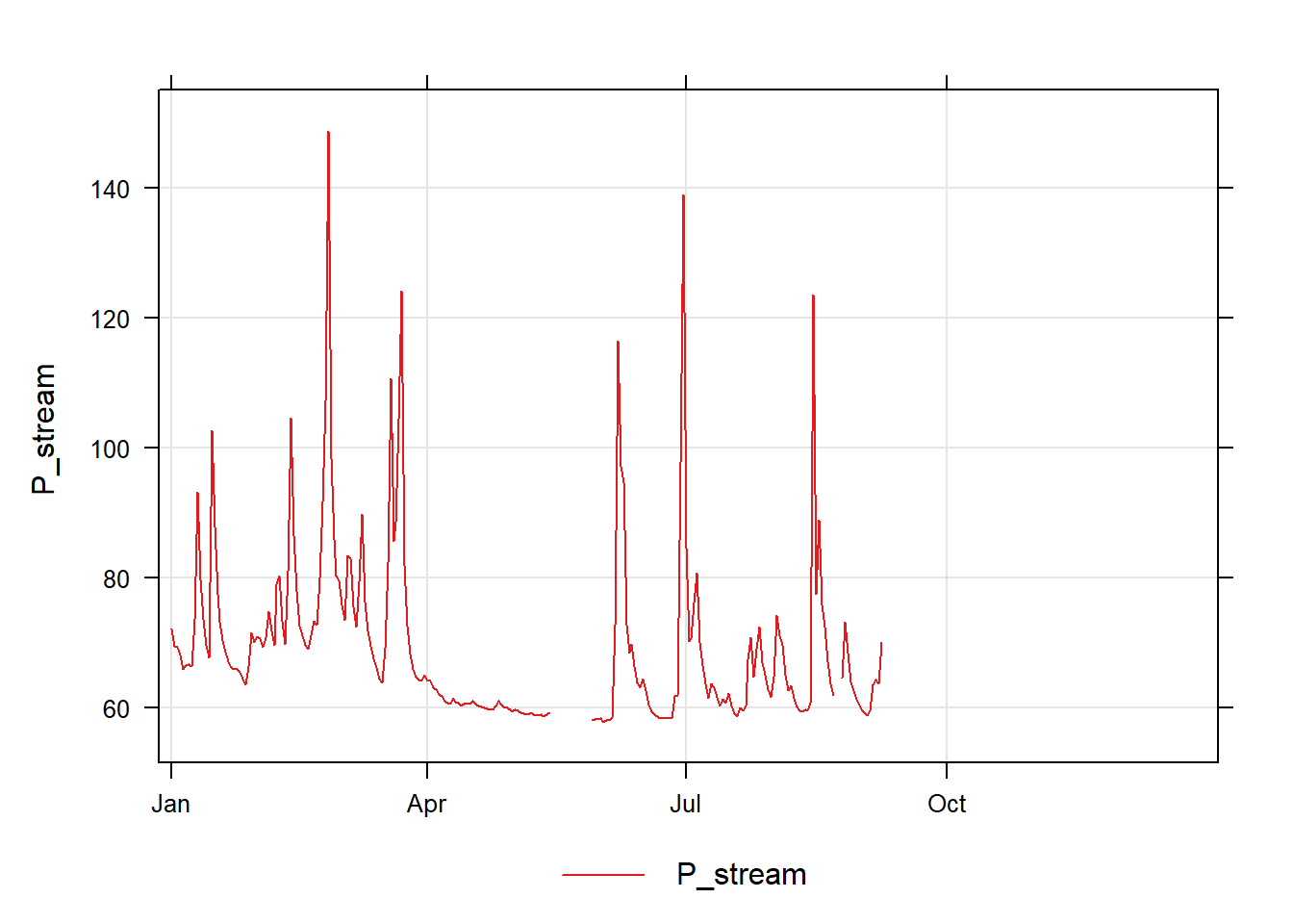
df - the continuous record of daily mean stream pressure for 2017
df_calib - the calibration data of stream pressure and actual streamflow (i.e. from manual height, width and velocity measurements).
We can plot the pressure data against time with the timePlot function.
# df is the common generic data frame namesummary(df)
      date               P_stream
 Min.   :2017-01-01   Min.   : 57.88
 1st Qu.:2017-04-02   1st Qu.: 60.51
 Median :2017-07-02   Median : 65.04
 Mean   :2017-07-02   Mean   : 69.53
 3rd Qu.:2017-10-01   3rd Qu.: 72.59
 Max.   :2017-12-31   Max.   :148.84
                      NA's   :130
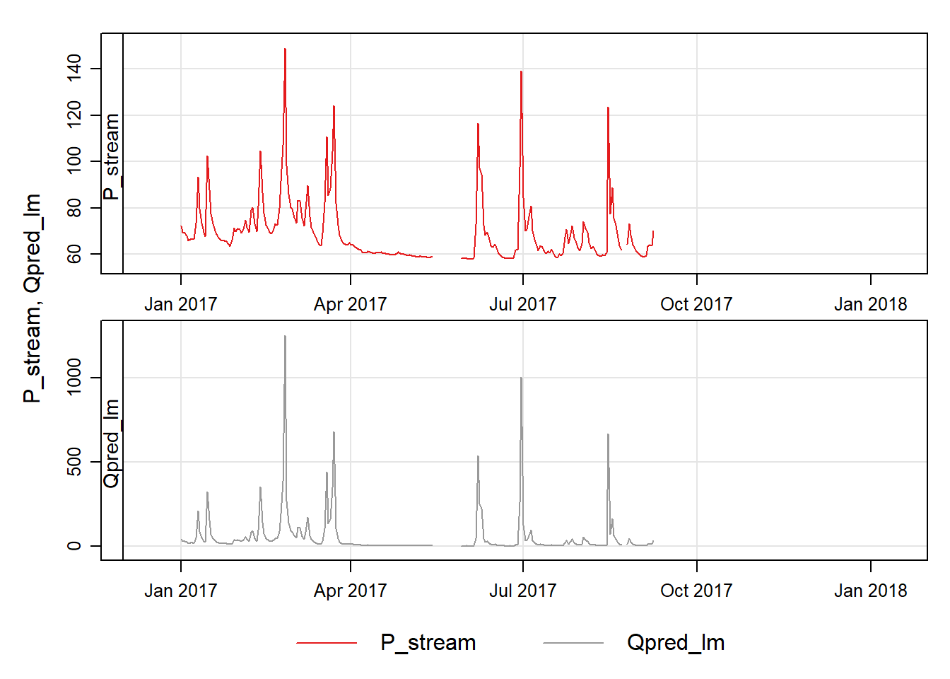
timePlot(df, pollutant =c("P_stream"))
What causes the peaks in the data?\(~\)
\(~\)
Calibration
Now we look at the calibration data, df_calib.
summary(df_calib)
      yday           datect                          P_stream
 Min.   : 12.0   Min.   :2017-01-13 11:59:44.00   Min.   :58.35
 1st Qu.:101.0   1st Qu.:2017-04-12 11:59:44.00   1st Qu.:64.15
 Median :184.0   Median :2017-07-04 11:59:44.00   Median :66.28
 Mean   :179.4   Mean   :2017-06-29 20:27:58.11   Mean   :69.12
 3rd Qu.:257.0   3rd Qu.:2017-09-15 11:59:44.00   3rd Qu.:70.24
 Max.   :339.0   Max.   :2017-12-06 11:59:44.00   Max.   :94.77
                                                  NA's   :6
       Q
 Min.   :  0.4045
 1st Qu.: 12.1786
 Median : 23.3039
 Mean   : 57.3015
 3rd Qu.: 65.4901
 Max.   :227.0471
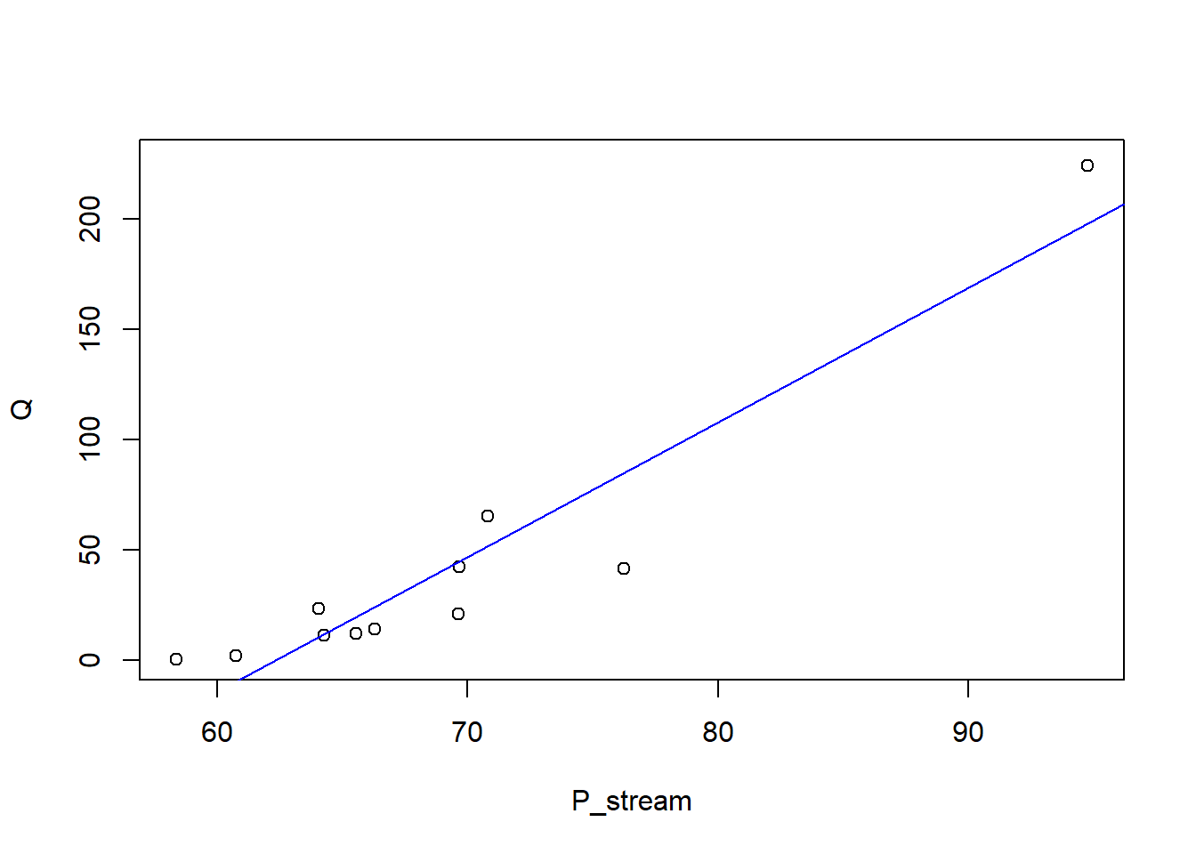
plot(Q ~ P_stream, data = df_calib)m_lm <-lm(Q ~ P_stream, data = df_calib)abline(m_lm, col ="blue")
Does the calibration curve look linear?
How does the range compare with the continuous data?
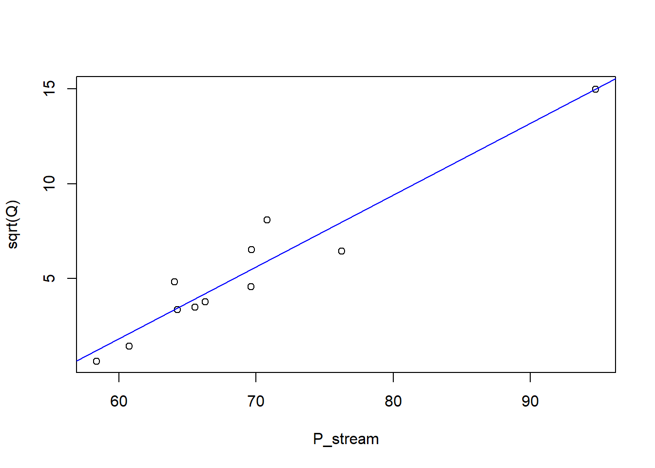
Using the standard R linear modelling function lm, we can fit a straight line to the square-root-transformed data.
plot(sqrt(Q) ~ P_stream, data = df_calib)## Fit a linear modelm_lm <-lm(sqrt(Q) ~ P_stream, data = df_calib)abline(m_lm, col ="blue")
Use summary(m_lm) to examine the model fit. The square-root-transformed version looks a much better fit to the data, especially if we have to extrapolate, so we choose this model, in mathematical form:
In the conventional (non-Bayesian) way, we would simply apply this fitted model to predict streamflow over the rest of the year with the following code.
      date               P_stream         Qpred_lm
 Min.   :2017-01-01   Min.   : 57.88   Min.   :   1.063
 1st Qu.:2017-04-02   1st Qu.: 60.51   1st Qu.:   4.113
 Median :2017-07-02   Median : 65.04   Median :  13.995
 Mean   :2017-07-02   Mean   : 69.53   Mean   :  56.550
 3rd Qu.:2017-10-01   3rd Qu.: 72.59   3rd Qu.:  43.529
 Max.   :2017-12-31   Max.   :148.84   Max.   :1256.864
                      NA's   :130      NA's   :130
This gives an estimate of the mean stream flow as 56.5 l s\(^{-1}\). However, we have not accounted for the uncertainty in the calibration curve in this estimate.
Bayesian estimation of the calibration curve parameters
To perform the same procedure, but in a Bayesian way, to include the calibration uncertainty, we can use the stan_glm function instead of lm. Rather than using least-squares to fit a single value, this estimates the posterior distribution of the calibration curve parameters by an efficient MCMC algorithm.
m <-stan_glm(sqrt(Q) ~ P_stream, data = df_calib)
You may wonder what we have just done.
stan_glm(sqrt(Q) ~ P_stream) performs several steps:
the linear model in R is translated into an equivalent probabilistic model in Stan, similar to a model written in JAGS, as you saw yesterday.
“weakly informative” prior distributions are set in the form of:
for the \(\beta\) coefficients, wide normal distributions, centred on zero, with widths scaled in an intelligent way;
for the residual error \(\sigma\), an exponential distributions (like the reciprocal prior we saw in geoR yesterday);
four MCMC chains are run, using the NUTS (“No U-Turn”) Sampler, an efficient algorithm for MCMC estimation of the parameter distributions.
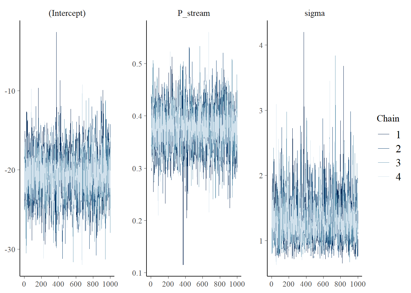
In the R console, you will see some of the output from the four MCMC chains.
and we can check the MCMC trace plots for convergence.
plot(m, "trace")
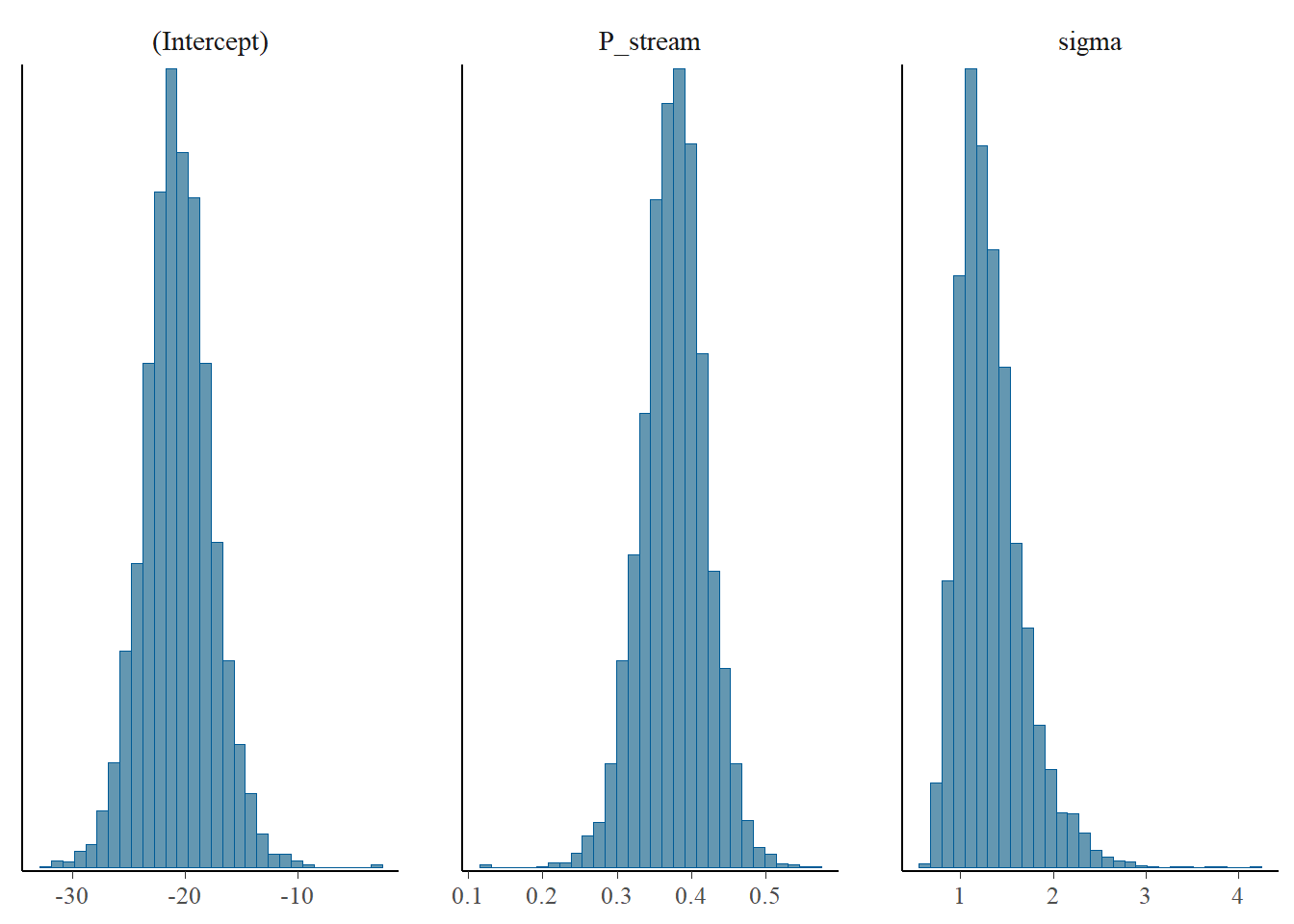
and the resulting parameter distributions.
plot(m, "hist")
`stat_bin()` using `bins = 30`. Pick better value with `binwidth`.
We can examine the output in more detail with summary(m, digits = 4), and interactively with:
launch_shinystan(m)
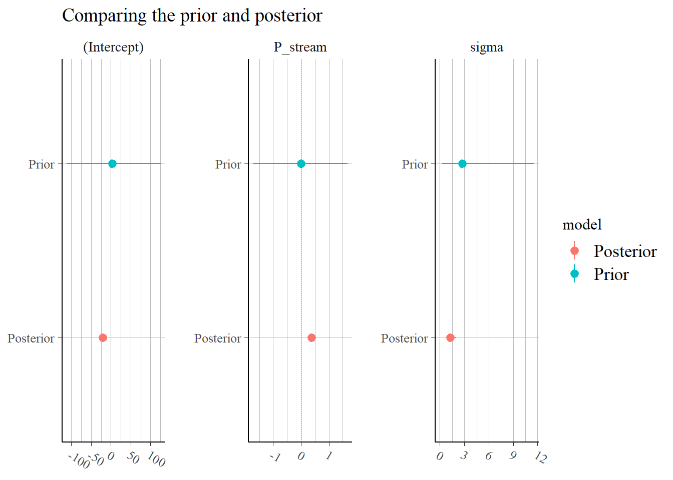
This all looks fine, though we might want longer chains to do this properly, but we can accept the posterior distributions as sensible. We can summarise the prior and posterior distributions graphically with the code below.
p <-posterior_vs_prior(m, group_by_parameter =TRUE, color_by ="vs", facet_args =list(scales ="free"))
Drawing from prior...
p <- p +geom_hline(yintercept =0, size =0.3, linetype =3) +coord_flip() +ggtitle("Comparing the prior and posterior")
Warning: Using `size` aesthetic for lines was deprecated in ggplot2 3.4.0.
ℹ Please use `linewidth` instead.
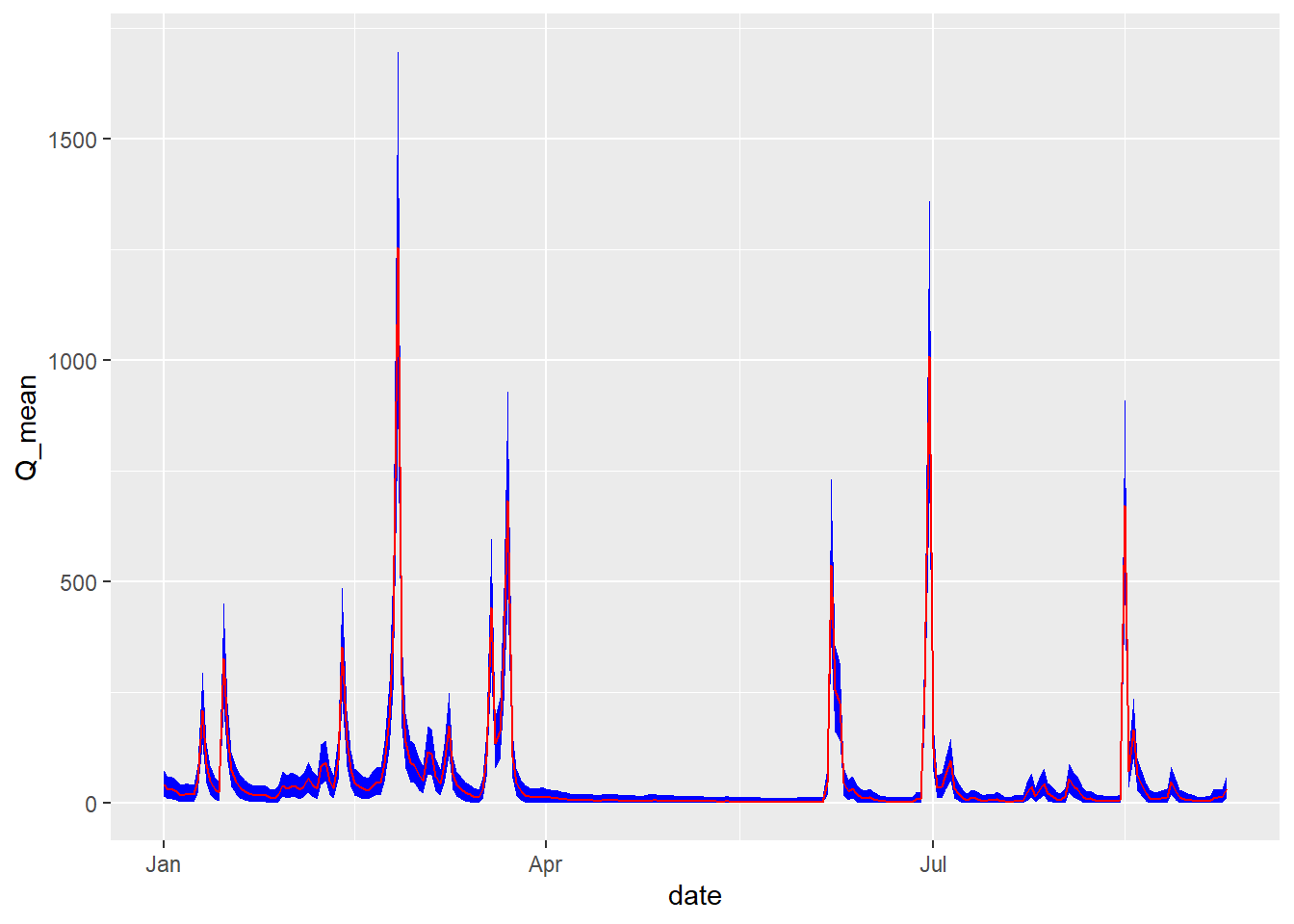
If we are happy with the estimated calibration parameters, we can use them to predict streamflow over the whole year. We use the posterior_predict function to predict with the parameter distributions estimated by stan_glm.
# make a new data frame without missing valuesdf_pred <-na.omit(df)# and predict with the parameter distributions estimated by stan_glmQ_pred <-posterior_predict(m, newdata = df_pred)^2
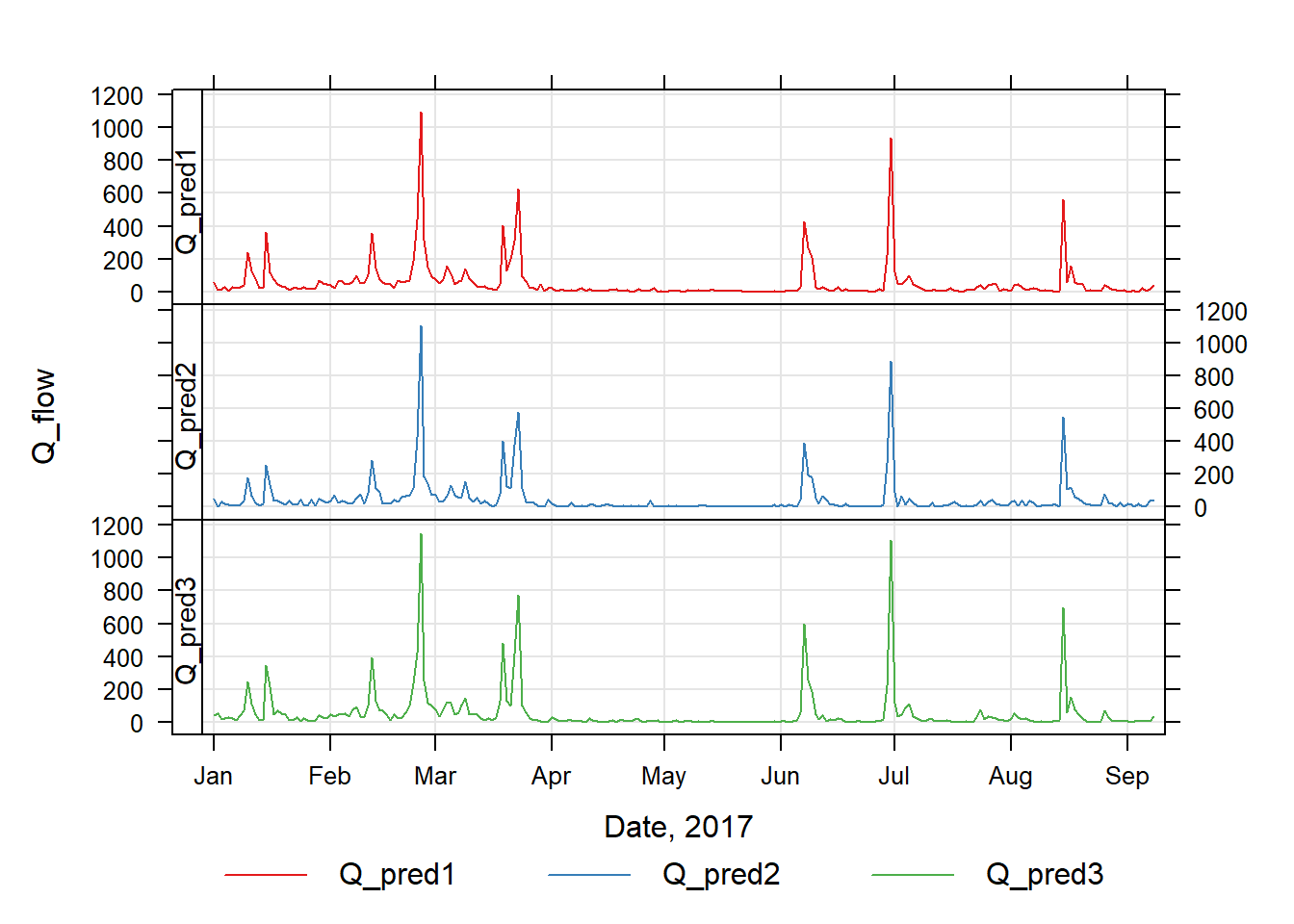
To examine these, we will plot three realisations out of the 4000 time series of \(Q_{\mathrm{flow}}\) this produces.
Finally, we can now compare the conventional and full Bayesian estimates of uncertainty. The conventional approach is to calculate the standard error in the mean.
# conventional mean and uncertaintymean(df$Qpred_lm, na.rm =TRUE)
[1] 56.54947
# SE in mean = sd/sqrt(n)se <-sd(df$Qpred_lm, na.rm =TRUE) /sqrt(sum(!is.na(df$Qpred_lm)))se; se^2# ^2 to give in variance units
[1] 9.04402
[1] 81.79429
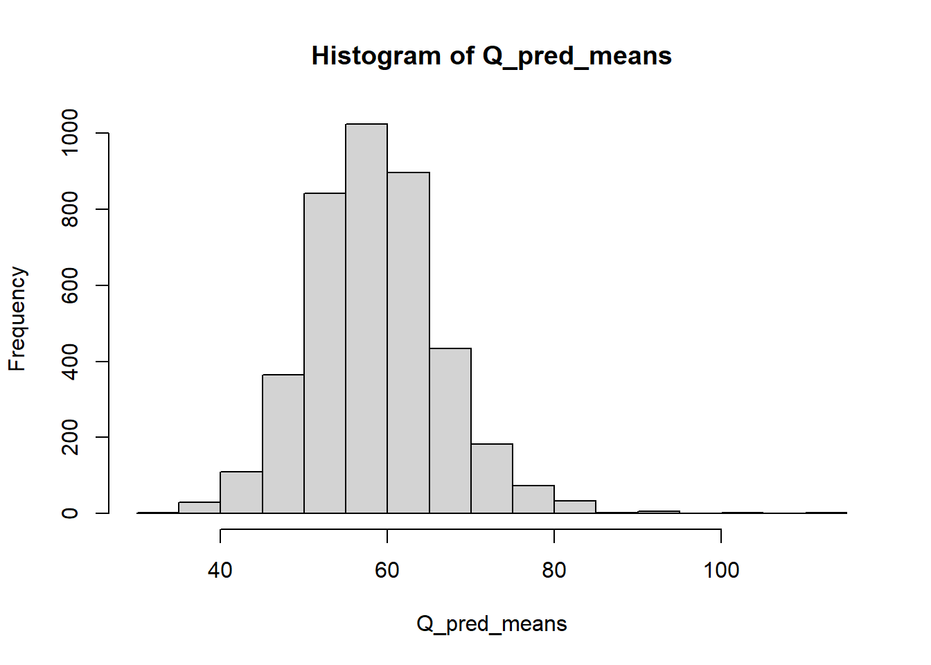
The Bayesian method calculates the additional uncertainty from the calibration relationship, so we have a distribution of possible means, plotted below.
# get the mean of each realisationQ_pred_means <-apply(Q_pred, 1, mean)hist(Q_pred_means)
The standard deviation in this distribution gives the additional uncertainty.
sd(Q_pred_means)
[1] 8.372378
# a coefficient of variationsd(Q_pred_means)/mean(Q_pred_means) *100
[1] 14.15515
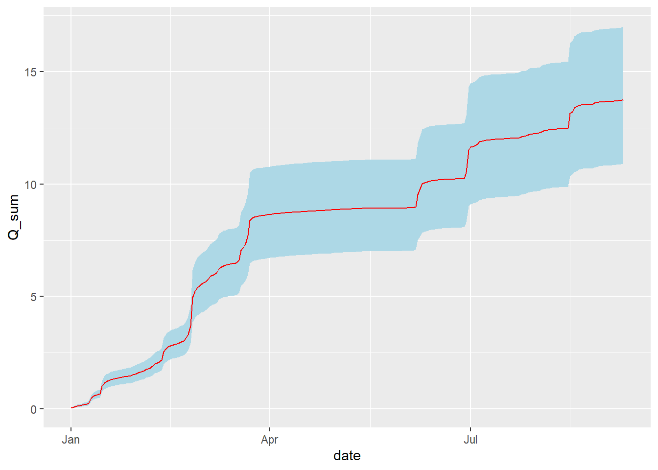
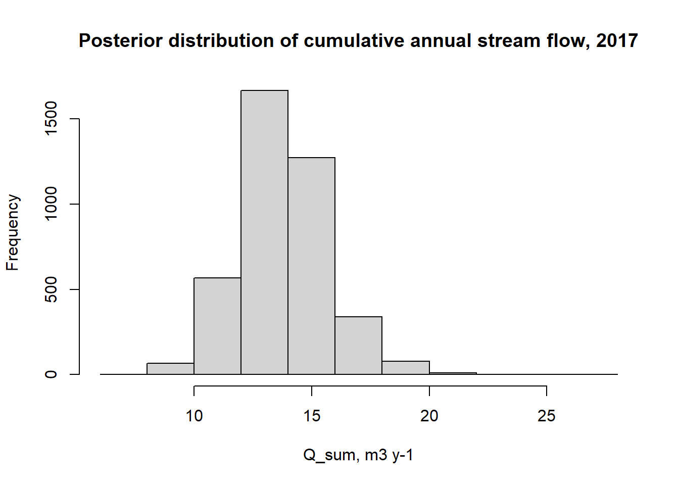
Often, we are interested in the uncertainty in the cumulative annual sum, for example, for comparison with total annual rainfall. The relative uncertainty in the sum is the same as in the mean. However, it is useful to consider the distribution of time series, to give a visualisation of the absolute uncertainty increasing over time, shown below:
# get cumulative sum for each realisationQ_pred_sum <-apply(Q_pred, 1, cumsum) /1000# l to m3df_pred$Q_sum <-apply(Q_pred_sum, 1, mean)df_pred$sum_quant_05 <-apply(Q_pred_sum, 1, quantile, c(0.05))df_pred$sum_quant_50 <-apply(Q_pred_sum, 1, quantile, c(0.50))df_pred$sum_quant_95 <-apply(Q_pred_sum, 1, quantile, c(0.95))p <-ggplot(df_pred, aes(date, y = Q_sum, ymin = sum_quant_05, ymax = sum_quant_95))p <- p +geom_ribbon(fill ="light blue")p <- p +geom_line(colour ="red")p
or as the distribution of the annual totals shown below.
hist(Q_pred_sum[dim(Q_pred_sum)[1],], xlab ="Q_sum, m3 y-1", main ="Posterior distribution of cumulative annual stream flow, 2017")